Take a step up from Excel


We hear it many times from our new customers – ‘Excel is a good spreadsheet program but lacks power when it comes to graphing and the plots are ugly’. You can always tell an Excel plot because it has crude lines, a limited set of symbols, and is a poor choice for scientific plots.
Isn’t it time to take a step up from Excel and create graphs you are proud to place in journals and on posters? Try KaleidaGraph today and find out how easy and inexpensive it is to create publication-quality scientific graphs.
And since our licenses are perpetual, there is no yearly subscription fee. The only cost in the future would be to optionally buy upgrades when they become available.
Try KaleidaGraph today!
Create your own plots using our FREE 30-day trial version.
Here are just a few comments from our customers as to why they switched from Excel to KaleidaGraph:
- Excel is too primitive for graphing.
- The option of symbols are too limited in Excel.
- With Excel I was frustrated about the strict nature of the formatting and color choices.
- KaleidaGraph provides me with the ease of changing and saving preferred display styles. I have yet to get Excel to save a particular layout and style.
- Curve fitting is very limited in Excel, and unlimited in KaleidaGraph.
Meeting the needs of scientists and engineers for over 35 years.
KaleidaGraph Graph Examples
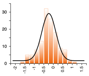
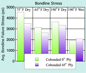
Featuring over 25 different plot types. Mac and Windows data and plot files are fully interchangeable.


We have a number of users who collect their data in Excel and then take it over to KaleidaGraph when it comes time to analyze the data and create publication-quality plots.
Here are just a few of KaleidaGraph’s features that are much more powerful and easier to utilize than in Excel:
- Ability to easily customize all aspects of the plot
- Axis breaks
- Offset axes
- Nonlinear curve fitting
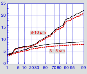
- Probability, Percentile, Dot, Step, and Polar plots
- Exporting plots as TIFF images
It’s time for a change. Make the switch to KaleidaGraph – the graphing tool you will depend on every day!
I started using KaleidaGraph about 30 years ago, as a much welcome upgrade to the venerable Cricket Graph, which I had used on an old MacPlus since 1986 - maybe started with KaleidaGraph when I got a Mac II with color monitor, although details not so clear as it was a long time ago. Since then I have introduced it to numerous PhD, Masters, and undergrad students, so have hopefully contributed somewhat to your growth. My first intervention was always to point out, when someone presented me with a horrible Excel 'chart', that it would really be much wiser to do such things with KaleidaGraph - nobody ever told me I was wrong about this! Best wishes for the future.